Air quality map
Check from our map what the air quality is like where you are right now.
You can also check how the air quality changes over the next few hours in the location of your choice.
On the map you can view:
- Air quality index
- Thoracic particles (PM10)
- Fine particles (PM2.5)
- Nitrogen dioxide (NO2)
- Ozone (O3)
- Black carbon (BC)
- Lung-deposited surface area (LDSA) of particles
The air quality map is based on modelling that combines, among other things, the information about air quality monitoring, weather, emissions (vehicular traffic, shipping, residential wood combustion, energy production), land use and long-range transport of air pollutants from outside the country’s borders. The most accurate information applied to modelling concerns traffic exhausts, while the emissions information on street dust and wood burning is more uncertain. Hence the map can sometimes show the air quality in some locations as clearly higher or lower than it is in reality.
If you wish, you can save the air quality map as a quick link: ilmanlaatukartta.hsy.fi
In this case, only the air quality map becomes visible, without any texts or instructions. If the map does not load properly, you should clear your browser cache and try again.
How do I use and interpret the air quality map?
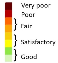
The air quality is presented in the air quality map using the air quality index.
- On the right side of the air quality map, there is a colour bar indicating the air quality:
- The air quality map always opens at the current hour. By moving the white circle at the top of the air quality map, you can check what the air quality has been or what it will be like in the next few hours. You can check the hourly air quality covering about 12 hours backwards and 24 hours forwards from the current hour.
- You can also allow the sharing of your location with the air quality map. There is a location button in the right top corner of the air quality map: by clicking on it you will share your location.
- You may view the air quality situation from further away or close up by clicking on the plus (+) or minus (-) sign in the left top corner of the air quality map. The buildings become visible when you zoom in. Buildings are not visible if the air quality map of the entire area is opened.
- You can view different types of air pollutants by clicking on the minus (-) sign in the right top corner. A list of the air pollutants will be shown. Additionally, at the bottom there is a link to instructions where you can get more specific information about the air quality map.
- When you have selected one of the pollutants, the colour scale on the right side of the map shows the numerical value of the concentration at the changing point of the colour.
- If you place the cursor on the numerical values of the colour scale, the unit (µg/m3) of the concentration and the pollutant abbreviation (PM10, PM2.5, NO2, O3, LDSA, BC) selected on the map are both shown.
- If you leaf through the various air pollutant maps, you will see which air pollutant is impacting the air quality the most at the time in question.
How to display an air quality graph of the selected location in a pop-up window
By clicking on a location in the air quality map, an air quality pop-up window opens up. This function works only if you have zoomed in so close that the buildings are visible.
- The pop-up window shows the air quality as a graph about 12 hours backwards and 24 hours forwards from the current hour at the location of your choice.
- The black vertical bar represents the current hour.
- You can close the pop-up window by clicking on the X button in the right top corner.
- The pop-up window becomes visible only at the same zooming level where the buildings come into view. It will not pop up in the map of the entire area.
- The air quality inside the buildings is not presented.
- You can also open a pop-up window for the different air pollutants (PM10, PM2.5, NO2, O3, LDSA, BC).
- The colour scale of the pop-up window shows the numerical value of the pollutant concentration at the changing point of the colour.